Microsoft has mostly kept the specifics of Windows 10X under wraps. It is a version of Windows 10 that targets dual-screen devices. Now, a major leak has given us a deep insight into the architecture and priorities behind the production of Windows 10X.
The leak, was discovered by Twitter user WalkingCat, which recorded via screenshots by another user. It is mentioned in the documentation that Windows 10X is optimized for both folding devices and classic laptops. Local applications and PWAs are to be on a par with Windows 10X.
The main objectives that Windows 10X should follow are user-friendliness, reliability, and usability. Essentially, the OS should provide the user with full functionality without being obstructive. An example of this is ‘Fast Settings.’ Where the user will find the most commonly used settings.
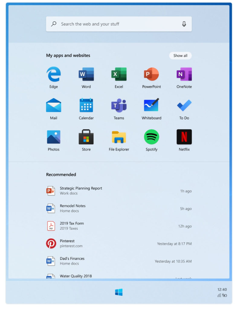
Also, it is worth noting that the Start Menu is referred to as the “Launcher”. It consists of a web search, a field of static, user-defined apps and web pages, and finally a list of recommended documents. You can find a list of pre-installed apps in the file.
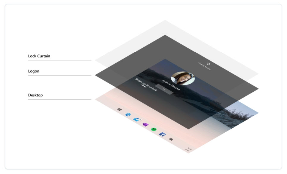
The “push-aside” style lock screen, now scrapped, lets users to quickly pass authentication as soon as they unlock their phone.
Now, let us take a look at the leaks below.
Contents
Windows 10X | Insight
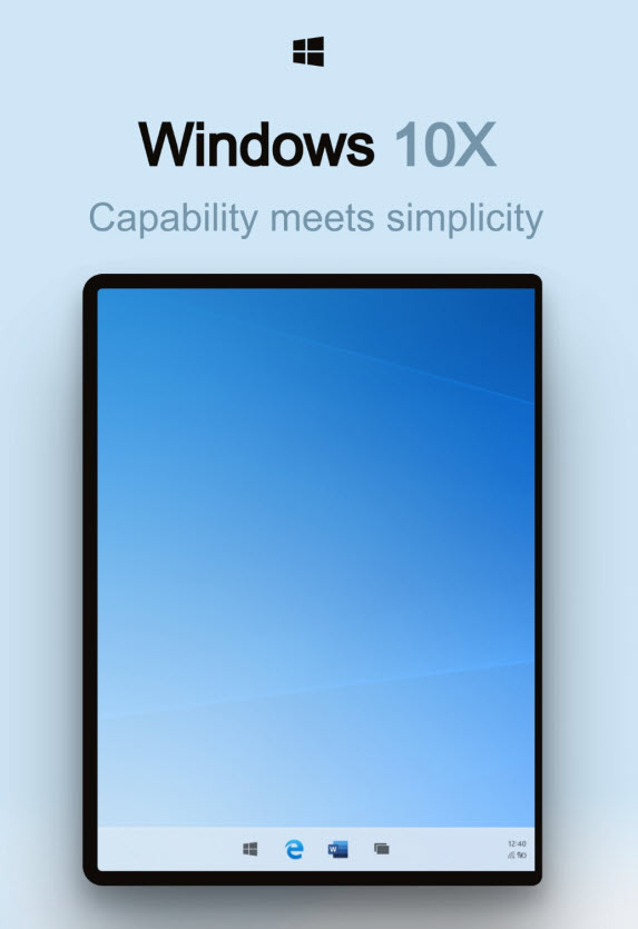
An OS that blends into the context. Based on an interactive system that allows you to focus on the task at hand.
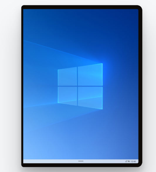
The deliberate approach to OS tasks is structured to launch, notify, search and more. Check out how to tackle each task simply and efficiently.
Guided by principles.
Inspired by people.
Effortless and magical, we have learned our past to educate our future. Designed around the needs of users, Santorini adapts to the way people interact with it.
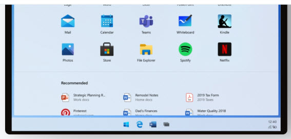
Launcher
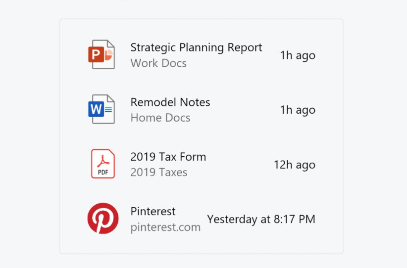
The launcher allows users to start and resume tasks quickly. Search seamlessly integrates with your device’s web results, apps, and personal files. Next up in the content hierarchy is your default grid app, which is customizable and modifiable to suit individual needs and preferences. The launcher is opened and further allows users to speed up the use of muscle memory over time. And lastly, Recommended Content is automatically modified based on your most commonly used applications, files, and websites. Jump back into your personal workflow without starting from scratch.
Goals & Principles
- Get back to your flow quickly and effortlessly;
- No dead ends if you can not find what you’re looking for;
- Build long term trust in the value of recommendations.
Windows 10X | Structure & Scope
Search
Find what you need on the internet, or check your computer for apps and files. The single entry point for searching through your phone is easy and effortless.
- Zero input suggestions;
- Active input and search results;
- Supports touch, keyboard, and voice input.
Apps and Websites
Drag and drop to re-arrange your websites and apps such that your highlights are at the forefront. To get all the other features, simply expand the “show all” list.
- Inbox default apps include: Edge, Mail, Calendar, Word, Excel, PowerPoint, OneNote, Teams, Whiteboard, To Do, Photos, Store, File Explorer, Spotify, Netflix, Camera, Solitaire, Calculator, Alarms & Clock, Movies & TV, Office, Sticky Notes, Paint, Learning Hub, Settings, Weather, Snip & Sketch, Voice Recorder, Groove Music, People, Notepad, Feedback Hub, Media Plan, Messaging, and up to 4 OEM apps.
- Create folders and groups by stacking apps together.
- Remove apps from the grid to remove them from your device.
Recommended
Jump back into your stream with recently installed apps; frequently used apps, files, and websites.
- Up to 10 high-confidence recommendations are visible at one time.
- If you can not find what you are looking for, tap “Show more” to expand more items inline or,
- “Open the file location” from one of the recommended files to explore related files.
Windows 10X | Lock / Logon
Logon has a simple job: get to your stuff as fast as you can.
With the Constrained Lock template, when the screen turns on, you are immediately taken to authentication status. And Unlike Windows 10, where you first need to disable the lock curtain before authentication. Windows Hello facial recognition and Windows Hello PIN during OOBE. When the device is woken up, Windows Hello Face instantly recognizes the user and then switches to their screen.
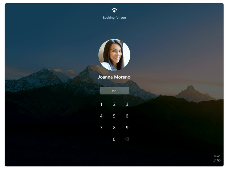
Goals & Principles
- The customer trusts the device to keep their data safe
- A customer can make their computing job as soon as possible
- The customer feels a personal connection to their device because it is tailor-made for them.
Structure and Scope
Quick Settings
Quick settings offer an almost seamless way for users to access their widely used settings. Settings currently exist on multiple surfaces, and there is no clear and consistent path for users to access the settings that are most important to them.
Goals and Principles
Efficient
Users can quickly change their critical device settings.
Focused
Shows only critical system settings so that users are not disturbed by other settings.
At A Glance
See the status of your device quickly.
Relevant
Give users the power to tailor the surface to suit their needs.
Structure and Scope
The Quick Settings surface has 2 levels of settings: L1 is the main quick layer, while L2 is available when more detail is needed for lightweight settings.
Defaults
- Wi-Fi
- Cell Data
- Input Language
- Compose Mode
- Bluetooth
- Airplane fashion
- Rotation lock
- Project
Taskbar
Goals and Principles
- A user can switch between applications on the taskbar
- The User can launch applications and websites from the taskbar
- Users also have access to applications and websites for frequent use
- The User also has entry points to launch Start, Task Switcher, and Quick Actions
Structure & Scope
- Running website
- Glomming
- Active state
- Running state
- Extended Ul
- Recent App
- System status
- Stacked system status
Taskbar Model
For both clamshells and foldable, the taskbar wants the same basic model with a series of “levers” that can be used to create an alternative in the model. While we’re still building the same initial model, we want to build a delta lever between the two experiments.
Levers include:
- Centered Vs. Left-aligned Taskbar content
- Number of pins
- Number of recents
- Order of recents
- Divider Vs. no divider
- Task View icon at far right vs. next to start
Connected
It’s the internet where I spend most of my time. I want to access my related files because they were part of the OS. All your things, right when you need it. Search all of your files on or offline in the Recommended Launcher tab. Experience the connected surfaces below in Windows 10X.
Family
There’s No Need for instructions. The OS is an intuitive mix of windows and apps that I use every day. Pick up Windows 10X and get back to your duties.

Adaptive
An OS that adapts to how I use each of the tools in my ecosystem. Windows 10X performs all the activities of my day with 8 different posts to help me get my work done.
Calm
A program that recognizes emphasis and precision by making a deliberate aesthetic selection.
Effortless
A process that doesn’t get in the way and lets me get what I want quicker. It’s certainly good to see that Microsoft is talking about its new OS, but it remains to be seen if the world still wants a new version of Windows.
Do share your thoughts regarding the post in the comments section below. If you liked the content, please show your support by visiting and Following us on our Facebook and Twitter accounts.
 Mobile Arrival Smartphones and gadget reviews, news and more.


It is appropriate time to make a few plans for the longer term and it’s time to be happy. I’ve learn this put up and if I could I desire to counsel you few fascinating issues or advice. Perhaps you can write subsequent articles regarding this article. I desire to learn even more things about it!
Sure. Why not!
I love this post. I have recently just started blogging. I feel like I am trying to do too much at the beginning, with no real clue of what I am doing. I am trying to connect with other bloggers as I start building my blog up. Thank you for the helpful tips as I start this venture.